At Dasheroo we use Google Sheets for, well, just about everything. They’re cool, they’re shareable and they won’t bring your non-Microsoft centric system down. Nuff said. So because we really needed them for our own use we figured “hey, wouldn’t the rest of the businesses in the world need a cool Google Sheets dashboard?” A resounding “YES” was heard.
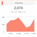
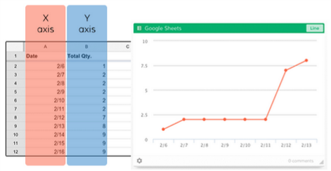
The Line Graph Insight
The line graph is a great insight that will quickly point out anomalies; you can compare them with other line graphs, and have great insight into what’s happening over a given time period.
The Line graph insight allows you to select two columns or two rows within your Google Sheet to display in a line chart. You’ll select one row/column to be the X (horizontal) axis and then the other row/column for the Y (vertical) axis.
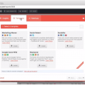
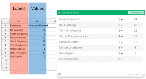
The Leaderboard Insight
A leaderboard lets you track who or what is in the lead! It’s great for tracking your salespeople, what products are sold the most or for us here at Dasheroo what business dashboard features are being requested the most!
The Leaderboard insight allows you to select two columns or rows within your Google Sheet to display in a dynamic leaderboard chart. One row/column will be Labels (e.g. names of your customer support reps) and the other will be the Values that correspond to the Labels (e.g. # of cases closed per rep).
Regardless of the ordering of your Sheet data in the columns/rows you selected, the Leaderboard insight will automatically sort the insight in descending order with the “leader” listed at the top. You’ll also be able to see trending information so you will know if something has jumped or dropped a few spots since you last checked your insight.
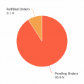
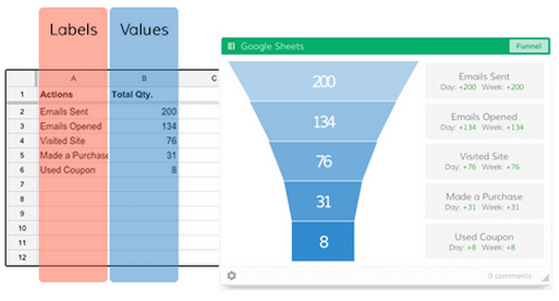
The Funnel Insight
We live and die by the funnel graph, read our post on How to Track a Conversion Funnel. They’re great for tracking conversion rates at every touchpoint. So you can see how many people started to do something and how many people completed what they were doing. For instance if you sent an email campaign you can see how many were sent, how many people opened, how many then clicked and how many ended up signing up or buying. Nifty eh?
The Funnel insight allows you to select two columns or rows within your Google Sheet to display in a funnel chart. One row/column will be set as Labels (e.g. the steps in a workflow) and the other will be the Values that correspond to the Labels (e.g. # of people who completed each step).
There you have it, go on in and play around with making awesome Google Sheets dashboards for your business.