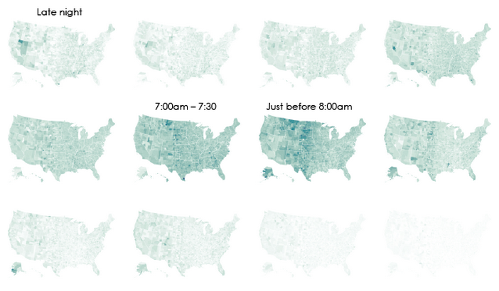
We went over to the folks at Flowingdata to see what amazing dataviz stuff they’ve been brewing. This one was pretty funny. They’ve got an interactive map that shows when people begin their commute and zero in on a county Nevada beginning at Midnight-5am. Not shocking, with agriculture and gaming in their backyard. Plus it’s just too hot to start the day later on!