Dasheroo Dashboards Get Great Press!

We always like to share with you when Dasheroo gets some great ink for our awesome dashboards, and just recently we had four great companies talking about Dasheroo, from marketing tools to marketing blogs! Thanks guys!

jotformJotForm

Dasheroo made a very relaxed list created by JotForm‘s own Chad Reid, Lazy Marketers: Here are Your New Tools. Thanks to Chad for putting us alongside some other great tools to help ease the workload like Help a Reporter Out (Haro) and Buffer!

Examiner.comExaminer logo for Dasheroo dashboards

Automation is a key to every business so that there is more time and energy to be focused on business growth. Dasheroo dashboards do just do that, and has made a list: 10 Affordable Tools That Automate Your Business for Faster Growth. Thanks, Norah.

Screen Shot 2016-02-10 at 4.24.18 PMCampaign Monitor

Dasheroo integration partner, Campaign Monitor listed the Dasheroo Blog in 51 Must-Read Marketing Blogs You Should Know.

funnlsfunnls logo for Dasheroo dashboards

The Dasheroo Blog gets some more attention in Charlie Rose‘s second year of this list Top 25 Marketing Blogs to Read in 2016 on his website funnls. Thanks again Charlie!

Dataviz: California’s Drought Report Card

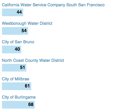
Thomas Suh Lauder over at the LA Times posted this amazing data visualization on how each district in California is utilizing our precious water. the Governor wants to cut water usage by 25% by 2016. Maybe those people who live next to us will finally stop pressure washing their building!!!

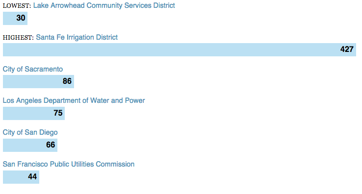
Anyhoo, we put our own zip code in the field and turns out that in comparison here in SF we’re not doing too bad (always could be better). Each resident of the San Francisco Public Utilities Commission used, on average, 44 gallons of water a day.

When we looked at nearby areas:

Screen Shot 2015-06-27 at 1.27.25 PM

When you compare that to the zips that use the least and the most? Santa Fe District just gets too dang hot!

Screen Shot 2015-06-27 at 1.25.56 PM


Check out more dataviz that we find here!

Dataviz: Where Are All Candidates to the Left?

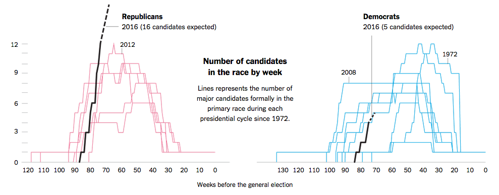
Since we’re data geeks here at Dasheroo we search out the best of the Web to find some great data visualizations for you and thanks to Flowingdata (we go to these gurus first to find our great examples of dataviz done right!) they pointed out that the New York Times had a great post about the 2016 Presidential candidates and when they entered the race. They also go on to show by days gone by who the winning candidates were and when they entered the race based on how many weeks were left.

The killer here is that this election cycle has the most candidates expected to run ever. Sixteen in total while the left has a mere 5. What’s up with that? Well it’s more than when Gore ran against just one competitor in 2000.

Get more of this awesome data by election year going back to 1972. Some may surprise you. Reagan was last in the race with just 50 weeks to go and he screamed ahead for the win while Hillary and Barack started 80 weeks out. Who knew?

NYT - Dataviz of presidential candidates


Get more amazing dataviz we find here.

Dataviz: How Much Water Produces Food

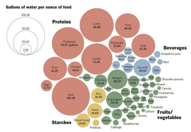
Flowingdata brings us another great dataviz from the LA times, thanks guys! The Times produced an interactive data visualization where you can choose the food you want to eat and it will show you how much water it took to get that food to your plate. It’s pretty frightening living in a California drought. Makes you want to eat strawberry, potato, eggplant salad with a glass of bubbly, YUM!

Dataviz on how much water it takes to produce food groups.


More amazing data visualizations we find are here!

Dataviz: What Gender Rules Which Social Networks?

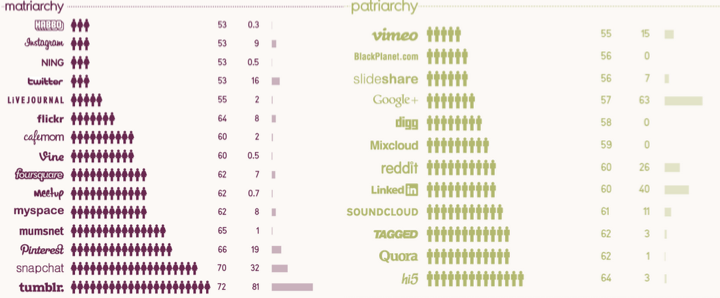
We love the guys over at Information is Beautiful and they’ve got a great data visualization (we like dataviz) out about the breakdown of men and women visiting social networks! Undeniably women rule.

Gender by social network usage.

So it look like the chicks rule the dudes on social media, right?

Our take-aways:

  • If Twitter ain’t on the list for men or women, who is using it?
  • Women love their tumblr and Pinterest, pictures work for the ladies, but foursquare, really?
  • Men love their geeky, gamey networks like Tagged who bought hi5 in 2011
  • MySpace…really guys?

Gender by social network usage.

Dataviz: Tracking America’s Commute, Hour by Hour

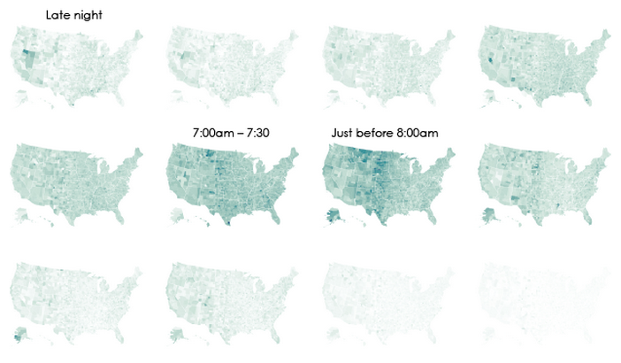
We went over to the folks at Flowingdata to see what amazing dataviz stuff they’ve been brewing. This one was pretty funny. They’ve got an interactive map that shows when people begin their commute and zero in on a county Nevada beginning at Midnight-5am. Not shocking, with agriculture and gaming in their backyard. Plus it’s just too hot to start the day later on!

Graph of when Americans commute to work.


More great data visualizations we find here!