Dataviz: Where Are All Candidates to the Left?

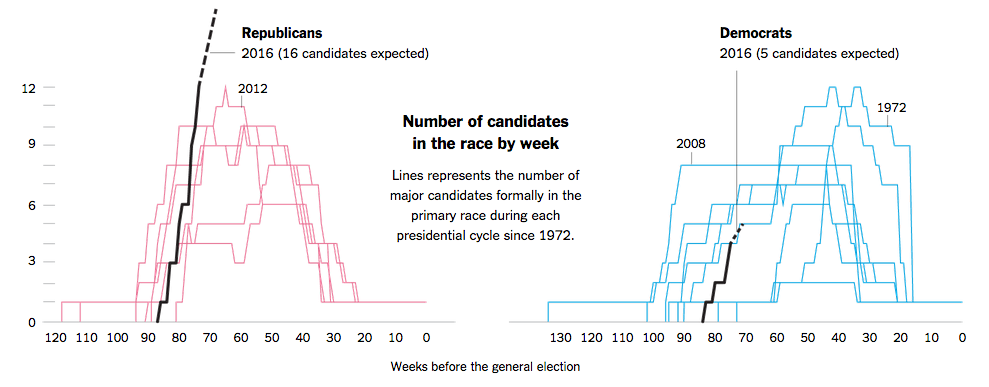
Since we’re data geeks here at Dasheroo we search out the best of the Web to find some great data visualizations for you and thanks to Flowingdata (we go to these gurus first to find our great examples of dataviz done right!) they pointed out that the New York Times had a great post about the 2016 Presidential candidates and when they entered the race. They also go on to show by days gone by who the winning candidates were and when they entered the race based on how many weeks were left.

The killer here is that this election cycle has the most candidates expected to run ever. Sixteen in total while the left has a mere 5. What’s up with that? Well it’s more than when Gore ran against just one competitor in 2000.

Get more of this awesome data by election year going back to 1972. Some may surprise you. Reagan was last in the race with just 50 weeks to go and he screamed ahead for the win while Hillary and Barack started 80 weeks out. Who knew?

NYT - Dataviz of presidential candidates


Get more amazing dataviz we find here.

Dataviz: Tracking The Growth of the MLB’s Facial Hair

Thanks Flowingdata for finding this GEM, an awesome dataviz by the Washington Post tracking facial hair in the MLB. Surprisingly our SF Giants are pretty far down the list, and thanks GS for the hairless Yanks!

Screen Shot 2015-04-02 at 2.53.22 PM


Even better?? You can upload a pic of yourself (or your nemesis) and see what they look like with a plethora of beard types! We had some fun with our team!

Screen Shot 2015-04-02 at 5.23.33 PM

Check out more dataviz stuff here!

Dataviz: Tracking America’s Commute, Hour by Hour

We went over to the folks at Flowingdata to see what amazing dataviz stuff they’ve been brewing. This one was pretty funny. They’ve got an interactive map that shows when people begin their commute and zero in on a county Nevada beginning at Midnight-5am. Not shocking, with agriculture and gaming in their backyard. Plus it’s just too hot to start the day later on!

Graph of when Americans commute to work.


More great data visualizations we find here!

Data Visualization: Comparing U.S. Population Segments

Thanks to the amazing folks at Flowingdata we’re always exposed to some great data visualizations. This one is awesome. Ben Blatt for Slate created this interactive masterpiece so you can compare the population density of different areas in the US. So if you click on New Jersey for instance, then click anywhere else on the map it’ll highlight a circular region with roughly the same population. What a great way to view how the US population is is distributed!

Not surprisingly the NY and Los Angeles rule it. But if you choose the Coasts and click on big square states insanity ensues!

Screen Shot 2014-10-18 at 10.37.22 AM