We are pretty adamant about getting our news headlines from two sources, The Daily Beast and Nextdraft (thanks to Dave Pell for THE most compelling headlines you’ll ever read in your entire life on this planet Earth.)
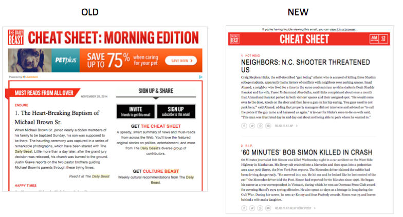
So recently we saw that The Daily Beast did a bit of an email marketing design makeover on their campaigns and we felt compelled to dissect the old vs. the new. Here goes:
- The old had just 2 spots for ads in the email. The new now has spots for 4 ads. More ads=more revenue. Good job.
- The old doesn’t have social links on each article, the new one allows one to socialize the article. We like that one!
- The new one is very text-heavy, they may be embracing the “less is more” rule?
- The old one doesn’t look super-great on mobile, the new one has larger text and is a bit more optimized for mobile, so it’s easier to read.
- The old one uses valuable space above-the-fold for sign up and invite, but these people are already getting the email. The new one uses the share links within each article and the follow links at the bottom. Once people are on the site, all information is very shareable.
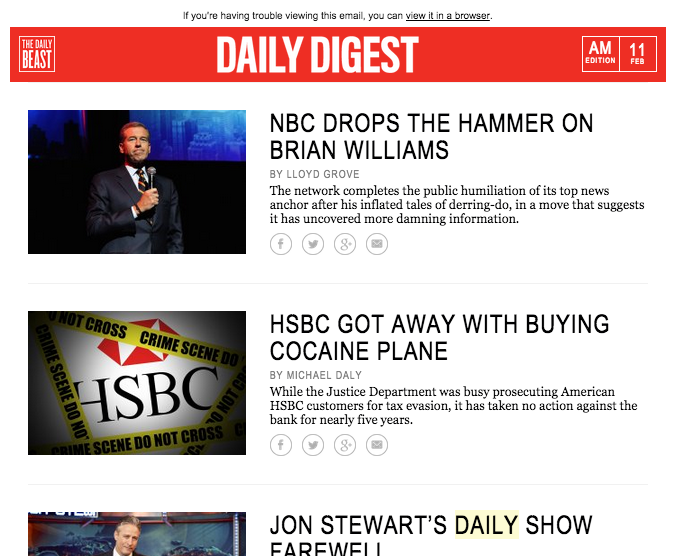
They added more emails! They started a new Daily Digest for only the most important can’t-miss news complete with images and incorporates their new best practices from above. Now we have to get to the bottom of Brian William’s on “leave”!
So if you’re in the mood to do some testing with your email marketing campaigns you might consider using a few of these ideas and see what happens!


