3 Important Trends to Spot in a Twitter Analytics Dashboard

With 320 million monthly active users, your business can’t afford to ignore the power of Twitter. The social giant provides an opportunity to connect with customers and prospects, share information, learn from others, and much more.

Just the same as every other social site, there are trends worth tracking. You need to know your audience inside and out. What type of information do they like? What type do they dislike? What do they best respond to?

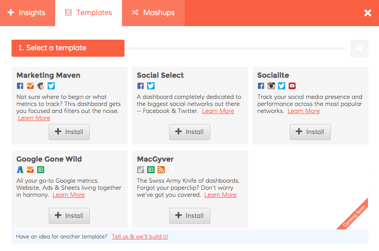
Below are three trends within a Twitter analytics dashboard that absolutely deserve your attention:

1. FollowersDasheroo Twitter dashboard

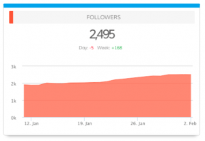
In simple terms, you want your number of followers to increase with each week. Do you notice your number of followers slowing down? If so, it may be time to:

  • Create more content.
  • Follow more people.
  • Engage with your audience.

Followers are the lifeblood of your Twitter strategy. These people truly care what you have to say. For this reason, more is always better. Make sure your follower count is trending upwards at all times.
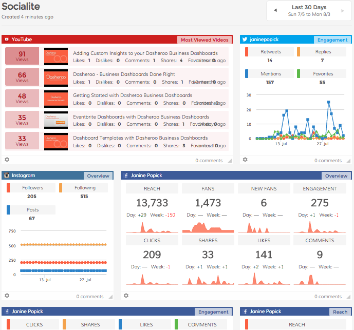
2. EngagementDasheroo Twitter Engagement Dashboard

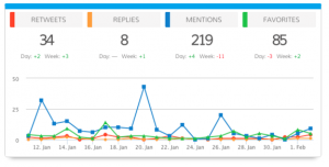
Have you ever found yourself in this position: you create a great piece of content, such as an infographic, that you are excited to share via Twitter.

You make the tweet live, sit back, and wait for the fun to begin. And then you realize something: nothing is happening.

You can have as many followers as you want, but what matters most is engagement. Are your tweets being retweeted by others? Are they clicking the “favorite heart” to show their support? Are you opening up a dialogue with your followers?

Remember these four points when tracking engagement:

  • Retweets
  • Replies
  • Mentions
  • Favorites

Just the same as followers, you want your number of engagements to continually climb.

3. Amplification RateDasheroo Twitter Amplification Rate

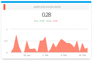
This trend doesn’t always get as much attention as it should. We define this as follows: “Rate that followers share your Tweets with their followers. Amplification = Number of RT’s per Tweet.”

You can only do so much when it comes to pushing and publicizing tweets. At somepoint, you need your audience to takeover and do some of the work for you. This is where amplification comes into play.

If your followers have a strong network, retweets allow your message to be quicklyamplified to a huge following. Tracking this trend is not optional. It is a must.

Along with the trends above, which others do you consider important to the success of your Twitter analytics strategy?

The Perfect Social Media Dashboard: The Socialite

Social Media is either something you love, love, love for your business or a complete thorn in your side! If you’re anything like us it’s a love fest with social media but we’re ok if you don’t love it so much, it certainly takes some time to devote to it to make it work.

On top of it all trying to track down what actually IS working and what isn’t is a real time suck, for us anyway. So when we really looked at what we needed to track here internally we thought “hmmm, if we need to consolidate our social media marketing metrics so does everyone else, let’s make a dashboard template!”

So without further adieu, simply click on Add Insights and Templates in the top of your Dasheroo menu and you’ll see this:

Dasheroo's social media marketing dashboard

Select “Socialite” if you need to see your metrics for Facebook, Instagram, Twitter and YouTube in an instant!

Dasheroo's Social Media Marketing dashboard template


Click to connect all of your social media accounts and you’ve got a fancy social media mix of awesome insights. You can add to this dashboard if you think the insights we selected don’t meet your needs or add any other application that makes sense like Google Analytics Sessions or LinkedIn insights.


Dasheroo's social media marketing dashboard


There you have it, a free social media dashboard in an instant!

What’s Really Important in a Google Analytics Dashboard

At Dasheroo we’re all about looking at our Google Analytics dashboards when we get up in the morning, multiple times during the day and before we go to bed at night. Why? We’re a growing online business and we want a quick snapshot of what’s working and more importantly what isn’t.

So here’s what a portion of our GA Dashboard looks like:

Screenshot of Dasheroo's own Google Analytics Dashboard

Here’s what we like to look at:

Since we do a ton of social media marketing (there’s a dashboard for that) we like to keep an eye on the Social Sources insight to track traffic to the website from our social channels. If you look at the pie chart above you’ll see that Facebook drives a ton of traffic for us which is great but every now and then we get a boost from Twitter, then we can go to ourTwitter Dashboard to see what’s driving the goodness.

We like to see our New and Returning Users insight. We always want to have newbies coming to our site more than returning users. The returning ones we love ALOT but they’re probably coming back to log in. A spike like the one you see just above is even better because that means a whole host of new users came to the site.

The Top Sources By Medium is a great way to track Google’s Channels to see how traffic is coming to your site. The Direct channel is people typing in your URL into the browser while the Organic channel is people searching on a keyword (not paid) and coming to your site. You can see here that there was a huge spike in Organic traffic on July 13. We like to closely monitor that especially since we don’t pay for it!

A screenshot of Dasheroo's Search Traffic on their dashboard.

We also track our internal metrics in a Custom Insight [ SHORT VIDEO]. In this case it’s the total number of people who register for a free business dashboard. We like to put it smack dab in the middle of our Google Analytics Dashboard right next to our Sessions insight. Why? We like to make sure we’re getting around a 10% conversion rate and we are, phew.

Dasheroo's dashboard with custom data.

If we see that there might be something going on with traffic, like maybe we got a new traffic source (or lost an existing one) we compare date ranges on the All Traffic insight. We select a date range or “Last Week” vs. a “30-Day” range and compare where traffic is coming from. In this one you’ll see we got a new source of traffic because LaunchingNext linked to us and included us in an email. Awesome!

Screenshot of Dasheroo dashboard for all traffic sources to your website.So there’s a quick overview of how we use our own Google Analytics dashboards. When we need to dive deeper we go directly into our Google Analytics native account, but this gives us a great starting point to ask questions.

Oh, we’ll be adding even more insights to Dasheroo so check back frequently but don’t worry, we’ll tell ya!