So I’m knee-deep in constructing a full 5-year financial plan, nailing our GTM strategy, building my sales organization, prepping an investor deck and all the other ‘big things’ CEOs do. You always need to focused on the activities that will maximize the value of the business.
But occasionally I need a mental break. That’s when I go into our CRM and really dig into a few of our recent customer’s profiles and usage, bang on our product or check out our website. It’s something everyone should take the time to do, whether it’s ‘someone else’s job’ or not.
The other day, I went to what we call our Insight Library page on our website. It’s where we list and show all the data sources we connect to. It’s an appealing looking graphic:
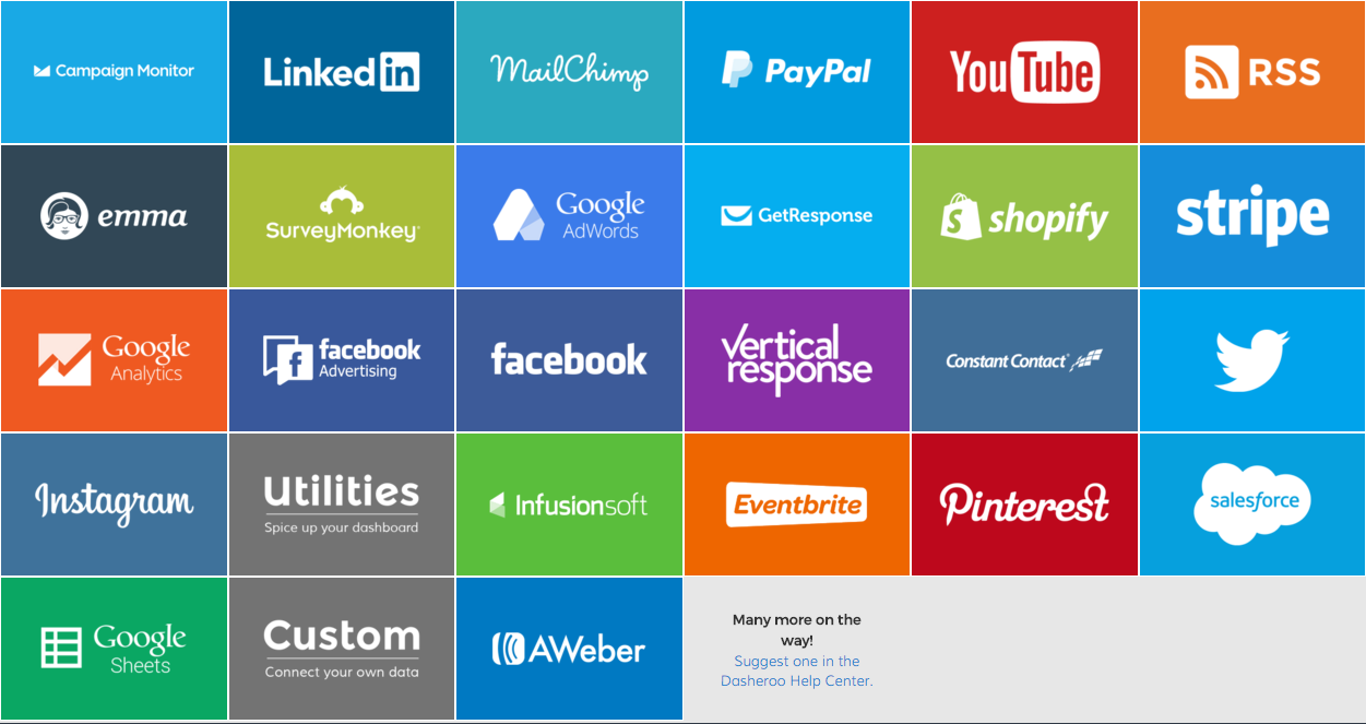
But I started to think as cool as it looked, it just wasn’t very readable; it was hard for me to find the ‘Constant Contact‘ tile, for instance. And if other folks were having a hard time seeing an app or data source they wanted, it could spell trouble for usage and conversion.
So I talked to two of my co-founders Alf and Janine and they agreed to take another look at the visual, with the aim of still having it look good, but more clean & functional:
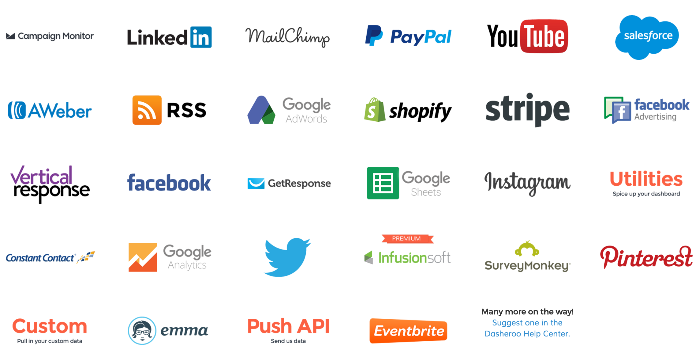
The result was easily found in Google Analytics! In December we had 1123 clicks on the tiles, and as of January 31 we had 1780 clicks on the tiles, a huge increase. That was cool! It really didn’t take more than a few minutes to look at our KPIs and figure out where we could make some changes. You never know what nuggets you might find on quick treasure hunt like that.
OK, back to 5-year financial planning!