If you use Google Analytics good for you! That means you understand what your visitors are doing and how you can make the most of your site navigation and pages right?
But, have you ever looked at comparing some metrics in the Google Analytics dashboard? It’s pretty fun, geeky fun, but fun just the same.
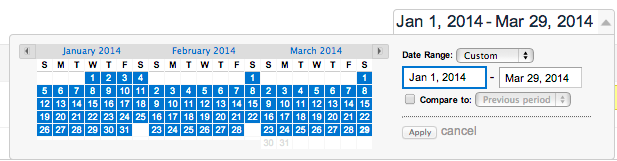
It’s easy to compare a metric in a date range just choose the date and check “compare”
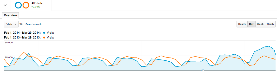
This graph shows that overall website visits the same time last year was about the same as this year except for the end of the timeline which shows an increase in 2014. There could have been a website change or more advertising dollars being spent. (Cool thing is that you can annotate that in the graph for future reference.)
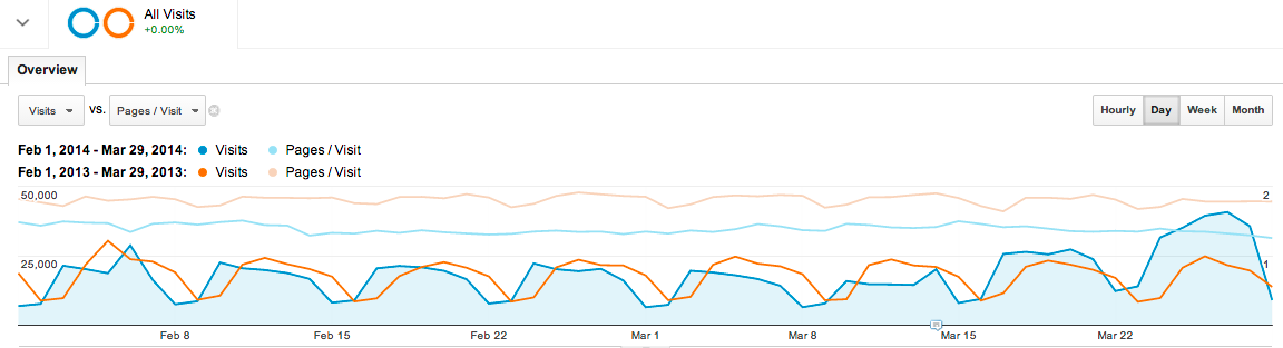
Taking it one step further you can add other metrics all on the same graph. This one shows that pages per visit from last year were higher than this year overall and this year is beginning to track even lower, even with visits increasing. If the website changed it may have had an effect on the number of pages that visitors were able to visit. Maybe that’s a good thing!
So there you have it. Use your Google Analytics dashboard to you advantage and see how your website is doing over time!