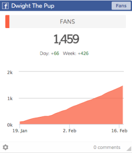
This line graph trends cumulative Facebook fans by day, it’s great!
When you create a bar chart or line graph it’s kinda important to think about what you really want out of it. Are you looking at a trend over time or do you want to view separate categories of growth (or decline!) We just had this conversation here at Dasheroo about the types of graphs we want to show you and why.
When to Use a Line Graph
These are graphs that show you a continuous trending over time. For instance you can see a cumulative number of Facebook followers you have OR you can see a daily line graph of new followers. A cumulative line graph might show you a consistent (up and to the right line graph where the latter shows you highs and lows of daily action. The x axis would be the date range and the y axis would be the number of followers.
When to Use a Bar Chart
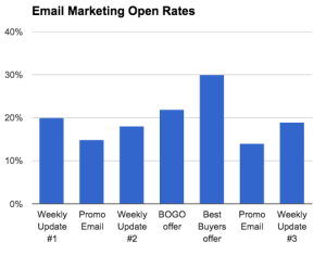
This is a great bar chart that shows different categories and how they compare to each other.
One way to use a bar chart is for categorical data. You can visually compare things from one month or day to another. While you can use a bar chart OR line chart for many of the same things a bar chart is also great for things that are not continuous.
For instance we may want to show a bar chart if you’re looking at comparing your email marketing campaign data. One campaign might have nothing to do with another but you still want to plot the open rates to see what types of campaigns are doing better than others.
You may have products you sell where you want to see that your oranges are selling better than your apples. It might make you rethink where you place your oranges in your store.
So make sure you think carefully about what you need to see before you put your data in the right graph.