Dasheroo Blog

Business Dashboards Done Right

Search the blog

Recent Posts

  • Facebook Ads: How’s Your Strategy Performing?
  • What Should You Look for in a Business Dashboard?
  • Email Marketing is Alive and Well in 2020
  • Top Social Media Resources for 2020 and Beyond
  • Dasheroo and HubSpot: A Perfect Combination

Categories

  • Agencies
  • Billing Dashboard Features
  • Business Dashboard Features
  • Business Data
  • Dasheroo Case Studies
  • Dasheroo for Agencies
  • Dasheroo for Salesforce.com
  • Dasheroo Press
  • Data Dashboard Features
  • Data Visualization
  • Email Marketing
  • Facebook
  • Google AdWords
  • Google Analytics Dashboard
  • Google Dashboard Features
  • HubSpot
  • Instagram
  • KPIs
  • LinkedIn
  • MailChimp Dashboard
  • Marketing Dashboard Features
  • New Features
  • Partner Spotlight
  • Pinterest
  • Sales Dashboard
  • Shopify
  • Social Media
  • Social Media Dashboard Features
  • Startup Lessons Learned
  • Stripe
  • Twitter Dashboard
  • Uncategorized
  • Weekly Progress
  • Who Charted?
  • YouTube

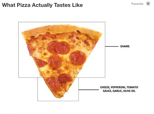
Who Charted? What Pizza Actually Tastes Like

February 22, 2015 by Team Dasheroo·0 Comments

What Pizza Actually Tastes like

More funny charts and graphs we find here!

funny charts funny graphs Pizza Who Charted

Post navigation

Previous Previous post: Dataviz: Measuring Boston’s Snow Depth By Dog Breed
Next Next post: Bar Chart or Line Graph, Which to Choose

Leave a Reply Cancel reply

You must be logged in to post a comment.

©2015 Dasheroo