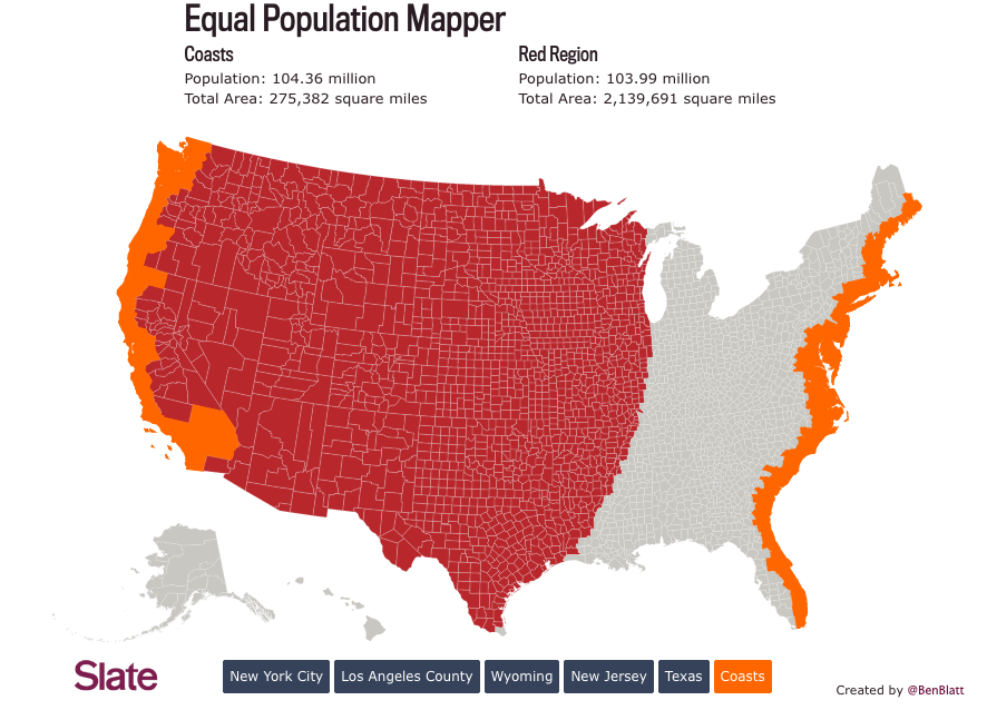
Thanks to the amazing folks at Flowingdata we’re always exposed to some great data visualizations. This one is awesome. Ben Blatt for Slate created this interactive masterpiece so you can compare the population density of different areas in the US. So if you click on New Jersey for instance, then click anywhere else on the map it’ll highlight a circular region with roughly the same population. What a great way to view how the US population is is distributed!
Not surprisingly the NY and Los Angeles rule it. But if you choose the Coasts and click on big square states insanity ensues!