 We’ve been working hard on rounding out our billing-payments-ecommerce dashboards for those of you who have been asking about tracking these metrics on your Dasheroo business dashboards. Makes sense right? Who wouldn’t want to see their marketing dollars well spent on how much money is coming in the door.
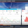
So without further adieu, here is what you can now see in your awesome Shopify dashboard!
Sales over time
- Trending insight of sales per day over the given time period represented as a line graph
- Average & Median Sale value by cart
Orders over time
- Trending insight of orders per day over the given time period represented as a line graph
Recent Activity
- Most recent sales from your storefront with the appropriate status represented as a table
Most Sales
- Transactions ranked in the order of $ sales, highest to lowest in the given time period represented as a table
Refunds Over Time
- Trending insight of refunds per day over the given time period
- Total refunds and total $ amount in refunds are represented as a line graph
Orders Received vs Fulfilled
- This is an insight that will compare the number of orders to the number of orders fulfilled in the given time period represented as a pie chart
- This tells you of all of your orders, how many remain to be fulfilled and the rate at which you are fulfilling orders
Orders vs Abandoned Checkout
- This is an Insight that will compare the number of orders to the number of checkouts that were abandoned represented as a pie chart
Top Products
- Leaderboard of the products that contributed most to the revenue in the given time period represented as a table
Customers Over Time
- This is a trending insight of customers the storefront has acquired per day over the given time period represented as a line graph.
- Total number of customers and total revenue
Sales by New and Repeat Customers
- This insight compares the sales generated by new and returning customers in Shopify represented as a pie chart
Top Customers
- Leaderboard of customers that generated most sales in the given time period represented as table
Top Sources
- This is a leaderboard of traffic sources that contributed to maximum sales represented as a line graph
- Traffic source include direct, referral , social, search engine represented as a table
Ok! If you use Shopify we’d love to hear your thoughts on what’s great, what’s not and what you need!


