Which Test Won? A/B Testing a Button Color on Mobile Devices

We love the guys over at Which Test Won, who do amazing a/b testing and we have written about them more than once because of how great it is! This test was awesome. The company Extra Storage Space tested two versions for a mobile website, one with a blue call-to-action and the other tested an orange button. The responders were making a reservation and moving into a storage unit.

They really wanted to test the button color for mobile to increase storage rentals. Most of the visits came from a mobile device. Version A had a site with a blue CTA and version B had an orange CTA button.


The Winner?

The blue button was the control. The orange button killed it with a 7.8% increase in reservations!

From Which Test Won:

“Research shows blue tends to be most people’s favorite color. Blue is used on many social media sites and in the financial industry to convey trust and security. “

Research has also found, yellow and orange typically elicit cheerful feelings. For many, yellow is the color of happiness. But, for many Extra Space Storage customers, it may not be a happy time. Again, the color may have been incongruent with visitors’ feelings.”

Something so small can be oh-so-right!

Which Test Won? A/B Testing Video vs. Datasheet

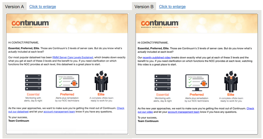
We always love the folks over at Which Test Won, they geek out on data like we do. So when Continuum, a company that offers remote monitoring and management services, networking solutions, and backup/recovery assistance, did a test on lead capture for an offer for a data sheet vs. a video, you would never believe which one won. See for yourself…

Which Test Won: Video vs. Datasheet for leads


Version A won! Can you believe it? It created a 63% increase in clickthroughs compared to the video offer.

What does Continuum say? Know your visitors! Figuring out how to appeal to them is crucial. Part of the a/b testing challenge is identifying the best format to serve them content.

Continuum wanted to test whether its partners wanted to get an email offering informational content in the form of a data sheet or a video.

According to Continuum many of their customers are: “…former IT employees from larger organizations who’ve left to start their own managed IT services business. These people are technicians at heart, but want to become better business owners.” They also thought that their “viewers wouldn’t take the time to watch a video, especially during business hours. However, the data sheet could be quickly scanned or printed out for later review.”

Continuum says that you should test your call to action; if your visitors prefer to quickly scan a sheet, send a data sheet. If they want to look at something more engaging, send them a link to your video. Then see what works best.

Great test!

Which Test Won: A/B Testing a Countdown Timer

We love our buds at Which Test Won, the masters of a/b testing, since we’re all geeky and into testing and data. Sign up for their emails, their testing is awesome!

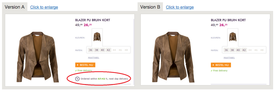
And this one rocks too. Would you say Version A with a countdown timer or Version B without a timer won?Screen Shot 2015-04-08 at 4.05.30 PM

Version A of course!

This one included a countdown timer on the page selling the jacket. Hokey? Some might say. But hokey just got Miss Etam, a leading Dutch women’s outfitter 8.6% lift in conversions. And not surprisingly a few hours befor the timer was going to finish the lift went nuts.

A total of 50,000 viewers saw the test. It ran for two weeks and achieved 99% confidence.

The agency that performed the test for their client De Nieuwe Zaak felt that the limited time offer was the winner. If people didn’t “act now” they’d be bummed, as a result a great result for their client. Oh and they tested the timer as a visual and as text and the visual won.


Thanks Which Test Won!

Which Test Won? Awesome A/B Testing of a Mobile Button

The great folks over at Which Test Won are at it again with some brand new a/b testing and this one’s a doozy. This test was run by Oxfam, a British-born-and-evolved movement who believes in a world without poverty, where people are valued and treated equally, enjoy their rights as full citizens, and can influence decisions affecting their lives. Very cool.

So obviously they rely on donations to keep their non-profit going. This test is pretty cool.

They tested:

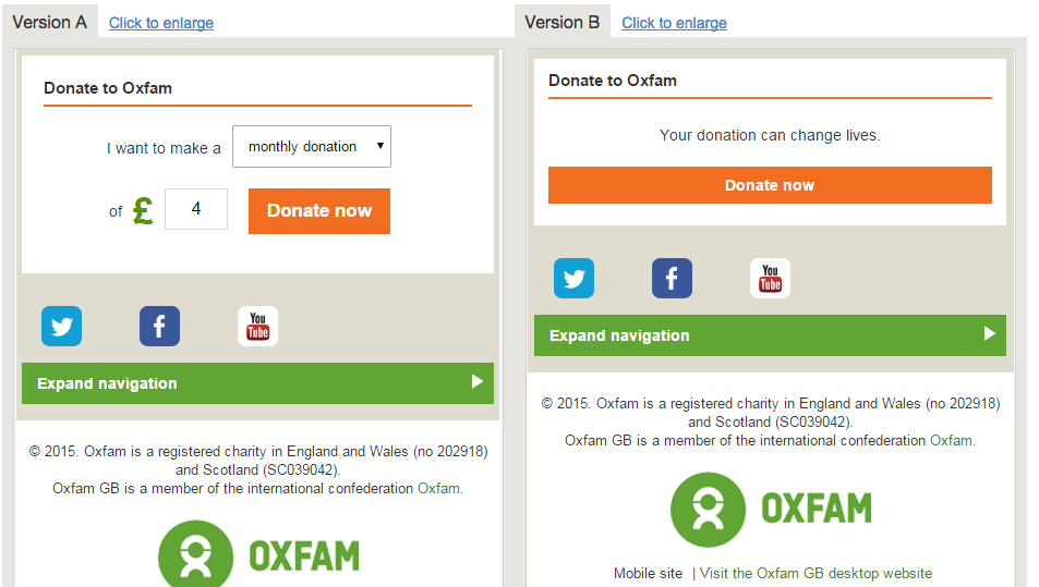
  • Version A had a fillable form where the user didn’t have to go to another landing page to fill it out.
  • Version B featured just a “Donate Now” button where you had another page to fill out.

Screen Shot 2015-02-18 at 9.37.21 AM

The Winner!

Version A, the fillable donation form won lifting donation click throughs by 23% compared to Version B and A increased completed donation by 131%!

We think Version A just made it easier to donate. You never know how many pages lie behind a “Donate Now” button and a simple way on one page to do it makes sense. Oxfam agrees with this “transparency.”

Check out the rest of the story here! Thanks again to Which Test Won, we love all of your a/b testing!

Which Test Won? A/B Testing: Aweber’s Amazing Results

From time to time we head on over to that amazing site WhichTestWon to see the latest and greatest marketing tests businesses are measuring and since we’re all geeky about measuring it gets us pretty excited!

The latest test is an awesome one. Why? It’s a B2B company! Many of the tests we see are with consumer-based companies.

So AWeber decided to do some a/b testing with their call-to-action button on their homepage for a week with one simple change, adding the word “Now.”

Which Test Won? Aweber's amazing results in a/b testingVersion A increased paid sign ups with a credit card by 12%, that’s nuts! So why not test some CTA’s yourself, use a tool like Optimizely to do it and measure your own results.
Which Test Won: A/B Testing for Arial vs. Calibri

The great people over at Which Test Won gave us more a/b testing to noodle on, a FONT test! Can you believe it? We love this stuff.

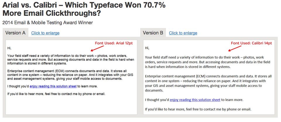
So, this content management software company Hyland uses Marketo and tested a font in an email. It was 12 point Arial vs. 14 point Calibri. It was a simple tex-based only email to their house list offering a datasheet to learn more about their system and it contained one link.

Which do you think won?

Screen Shot 2014-11-19 at 8.45.30 AM

Version B won increasing clicks by 70.7% at a 99% confidence level! Even though it’s a Microsoft font we’ll give it props.

Have you done any testing like this?