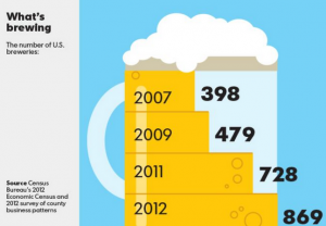
 We recently saw a cute USA Today Snapshot (loves those infographics!) of the growth of breweries in the U.S. from 2007-2012. We looked and thought whoa that is some growth there. From 2009-2011 growth almost doubled! Perhaps the result of the craft beer movement?
So then we wanted to cross-reference it with Yelp Trends, another nifty data tool based on Yelp searches in specific regions. Plus we’re that geeky about data!
So we chose the keyword “craft beer” (since there weren’t any real changes for “microbrew” or “brewery”) to see if there were any anomalies in the number of searches on Yelp and we chose New York because of the sheer volume of searches we thought would be happening.
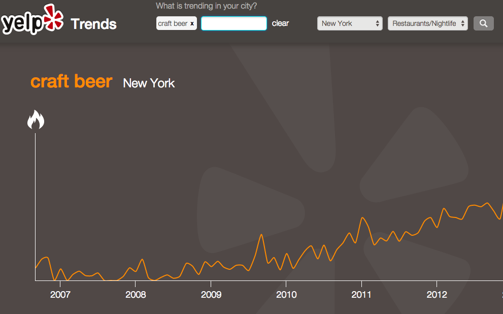
You know what? It matched! Check out the spike on searches from 2009-2011.
We love data visualization stuff like this because at our business dashboard company Dasheroo, we’re into trying to make sense out of data and beer just seems to be a great example!