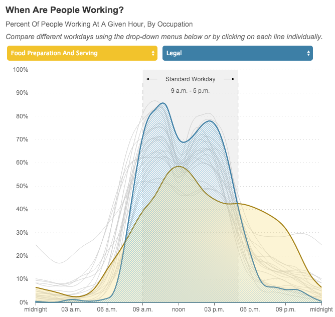
We ran across this cool graph that shows by occupation when Americans are in the office (or just working if they don’t have one) by NPR and it’s pretty cool. Food prep and serving have some looooong hours. Get in there and select occupations to compare, it’s a pretty cool data visualization and you know how geeky we are about this stuff!