We were in Seattle a few years ago for a seminar from data viz whiz Edward Tufte. This guy abhors pie charts. Tufte says things like “the only thing worse than one pie chart is lots of them”, or “if you want to hide bad data, use a pie chart”, and “what do you call a bus full of pie charts that drive off a bridge? A good start!” (ok, he didn’t go that far, but you get the gist).
But, is there a time for when to use pie charts in your world? Well, maybe depending on your goals. Because for one, as brilliant as Tufte is, he’s one of those types that won’t make a concession outside of his world of very data-dense, 2-dimensional graphical representations. See below, do you think the pie chart or the bar graph does a better job of communicating information quickly and accurately (the goal of any chart)? If you first asked, “Well, what’s the goal of the chart?” well done! So, if the goal of the chart is to highlight that the 2 largest players control almost 2/3 of the market, which does a better job? Tell us what you think!
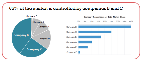
When to use pie charts? The much lambasted pie chart comes in handy for this use!
Now, if your goal is to communicate absolute market share for the top 6 companies in the market, the bar graph wins hands-down. So, although we do not currently use pie charts for any of our business dashboard Insights, we’ll keep an open mind as we encourage you to as well!