We’ve been reading this book Creating More Effective Graphs by Naomi B. Robbins. It’s a pretty cool and easy read and great for us as we’re presenting your data to you in the proper formats.
She writes in the book that you should avoid putting extra dimensions in your charts altogether. That three dimensional charts are difficult to read and that a two-dimensional chart is clearer than a three dimensional bar chart.
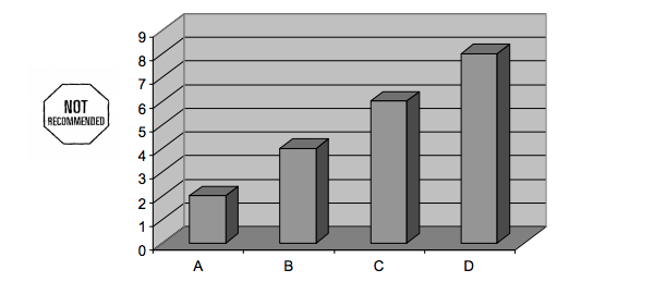
Where do we look for the “real” data point?
The reason for this is that the view isn’t really sure if the front of the bar or the back of the bar is where the data really is and this is all based on which software program you used to generate it. Basically it’s different for each one!
Bottom line, get rid of a dimension and make it flat and you’ll be golden!