Internally here at Dasheroo we’re talking about introducing a new type of graph/chart to our users when we launch. We’ve got a ton of line graphs but a gauge would look awesome, right? Are you in the red or the green? It’s easy on the eyes and you know pretty quickly how you’re doing.
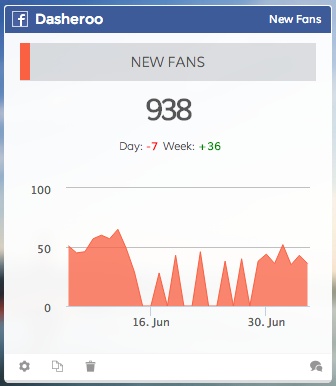
See our Dasheroo “New Fans” Insight on our dashboard? The line graph hits zero a few times. Oh no! That means our Facebook Like campaigns stopped running and we need more Likes!
Specifically we were looking at using a gauge for “engagement rate” on Facebook. But when we got right down to it, we’d really like to know the TREND of the engagement rate. A simple number on a gauge isn’t going to mean much for this data unless we know what happened before or what we want to happen in the future. This is why a gauge just wouldn’t work.
Line graphs quickly point out anomalies; you can compare them with other line graphs, and have great insight into what’s happening over a given time period.
For instance we were looking at our Facebook Insights on our business dashboard at Dasheroo (image to the right) and we saw that on a few days we HAD NO LIKES!! That could only mean one thing: our Facebook “Like” Campaign had run its course. Dasheroo to the rescue! Off to Facebook we went and immediately extended the date on our campaign. Likes started to pour in again. Nice!
We’ll introduce gauges at some point when you can plot where you are to a goal but you’ll be seeing a lot of great line graphs that save the day in Dasheroo.