More funny graphs and charts we find are here.
Insight Riot
Vote for your favorite app and we'll build it a Dasheroo Insight — Vote Now
More funny graphs and charts we find are here.
We visited Flowing Data which love to do, to find that they found a great data visualization on words used most BY DECADE in Billboard’s top songs going back to 1890!! Awesome to track the words and compare them from this decade to, let’s say the 60s.
For fun we took the most used words from each decade to see if we could make a new song title:
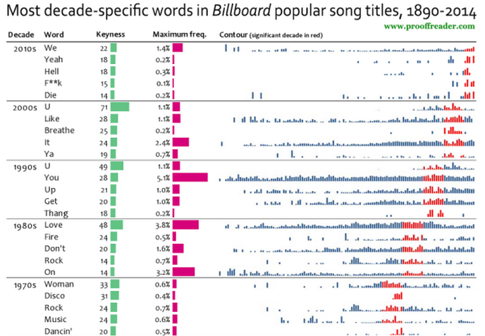
Go here to see the rest of the decades!
We always head over to Flowing Data to see what cool new data visualizations they’ve come up with or surfaced. This one is priceless. A Reddit user tracked his heart rate before and after his proposal while in Italy for 40 minutes. Wearing a heart rate belt you can see how he freaked out during the day and during the proposal, then calmed down and sat on a bench.

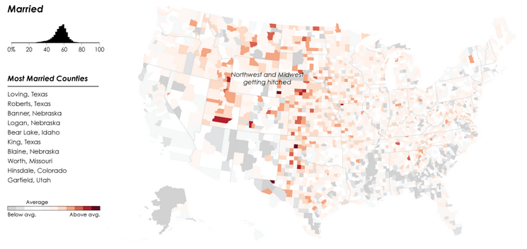
The awesome folks over at Flowing Data are at it again with the mapping relationship status by geography in the U.S. You’ll get a jaw-dropping picture of where more single, married, divorced, widowed and separated people are by county! Who knew?
We put our request for maps into the Dasheroo dashboard generator crew, we’ll see what we get!
Download this infographic.
More funny charts we find here!
Did you ever think that color could make a huge difference in your marketing? Well it can and it’s been tried and tested but with no simple answer. Kissmetrics put together a few infographics (great dataviz btw!) that show how color could really affect outcomes from testing they’ve uncovered. It’s all about measurement isn’t it?
Most people make decisions based on VISUAL.
It takes NO time for our minds to make a call!
Test it! This simple test of a button color change got 21% increase in clicks.
People in North America see color different than other countries.
Does green mean GO? Or are you too relaxed to move when you see it?
Selling high end Jewelry? Consider testing sky blue instead of orange!
We’re gearing up to shop small this Saturday, are you? Small Business Saturday helps SMB retailers to grow, and we’re 100% behind that! So this Saturday, the day after US Thanksgiving go on out and support local businesses and online small retailers.
Thanks to the fine folks over at Constant Contact we got this great infographic (since we’re into that geeky dataviz kind of stuff) and we were happy at the findings since it’s regarding how small businesses use data.
We like to see that:
Since we’re sucker for awesome ways to present data we scour the Web for fun ways to look at data. We found a winner!
Thanks to Information is Beautiful we have a great graph that plots which dog is tops and which is likely forgotten. Thanks to Miriam Quick, Andrew Park and David McCandless for this fun look at what pooch makes the grade based on longevity, intelligence, ailments, costs, grooming and appetite to give you your doggy data score. Where does yours fall?
More cool dataviz stuff we find.
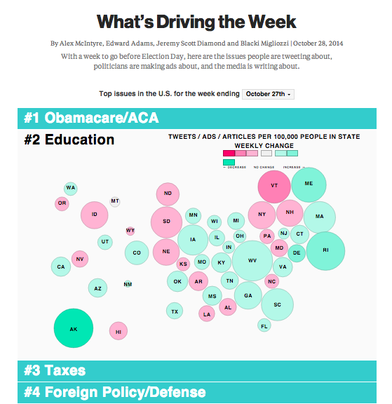
Right before mid-term elections Bloomberg published this great dataviz on what topics were trending by state. The data tracks Twitter topics, political ads, and what the media is writing about.
It’s a great interactive tool where you can really see for instance who cares about taxes vs. gay marriage.